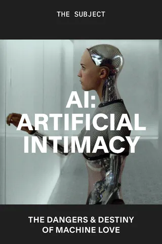
Scene Genie
By Robert Bound
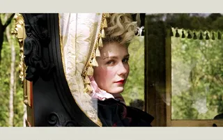
Marie Antoinette, dir. Sofia Coppola, 2006
Scene Genie
By Robert Bound
Production designer K.K. Barrett on how sets and sensibility elevate essential films by Sofia Coppola and Spike Jonze
K.K. Barrett has been production designer on some of the most visually arresting and emotionally involving films of the last 40 years. His subtle work in a confoundingly lonely Tokyo for Sofia Coppola’s Lost in Translation (2003) became a byword for exotic dislocation, making a virtue of the city’s neon spectacular and that dreaded connoisseurship of the insomniac traveler: predawn light. The courtly pomp of Coppola’s Marie Antoinette (2006) was Barrett’s first dive into history and biography, albeit contemporized and peppered with Hollywood bling. But it’s Barrett’s work with Spike Jonze that has been a career-spanning triumph, from the absurd realities of Being John Malkovich (1999) and the warped ordinariness of Adaptation (2002) to the weird wonder of Where the Wild Things Are (2009) and the stylish techno-futurism of Her (2013). Before (and during) his film career, Barrett was designing music videos for the likes of Smashing Pumpkins and Beck, alongside commercial projects—all this after starting out as the drummer in electropunk outfit the Screamers. No wonder, then, that Barrett gives his films such rhythm.
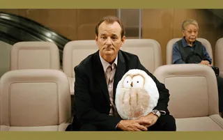
Her, dir. Spike Jonze, 2013
How do you start generating ideas at the beginning of a new project?
As soon as you get the script, you’re working away in your head. You’re almost working for free! In fact, a script can be a terrible thing to have in your hands, because as soon as you’ve read it, you can’t stop thinking about it. The first official month of a project is the hardest because you’re trying to figure out what to do. I start with no preconceptions and no guidelines—sometimes I’ll even abandon my visual notes in the script. First reactions can be totally genius or terribly clichéd. I want to filter through and get rid of the worst of those first conceptions, which are usually the low-hanging fruit, the easy ideas, to get into stuff that could be adapted to make this new thing something unusual.
So you’re editing down possibilities more than relying on flashes of inspiration?
It’s a continual process. My first stop on getting a script is to ask the director a lot of questions. I’ve been lucky to work with a lot of writer-directors, but surprisingly, even if someone wrote the script, they don’t have all the answers, because they don’t have the visual answers. They write from memory, so they may have a place that they recall or imagine. It’s a placeholder, and we’ll then develop it and explore it together. Her started so upside down, with me and Spike being excited about designing a potential future. Slowly we realized that that was a fool’s game and had been done so many times before—we really didn’t want to fall into the trap of it looking dated.
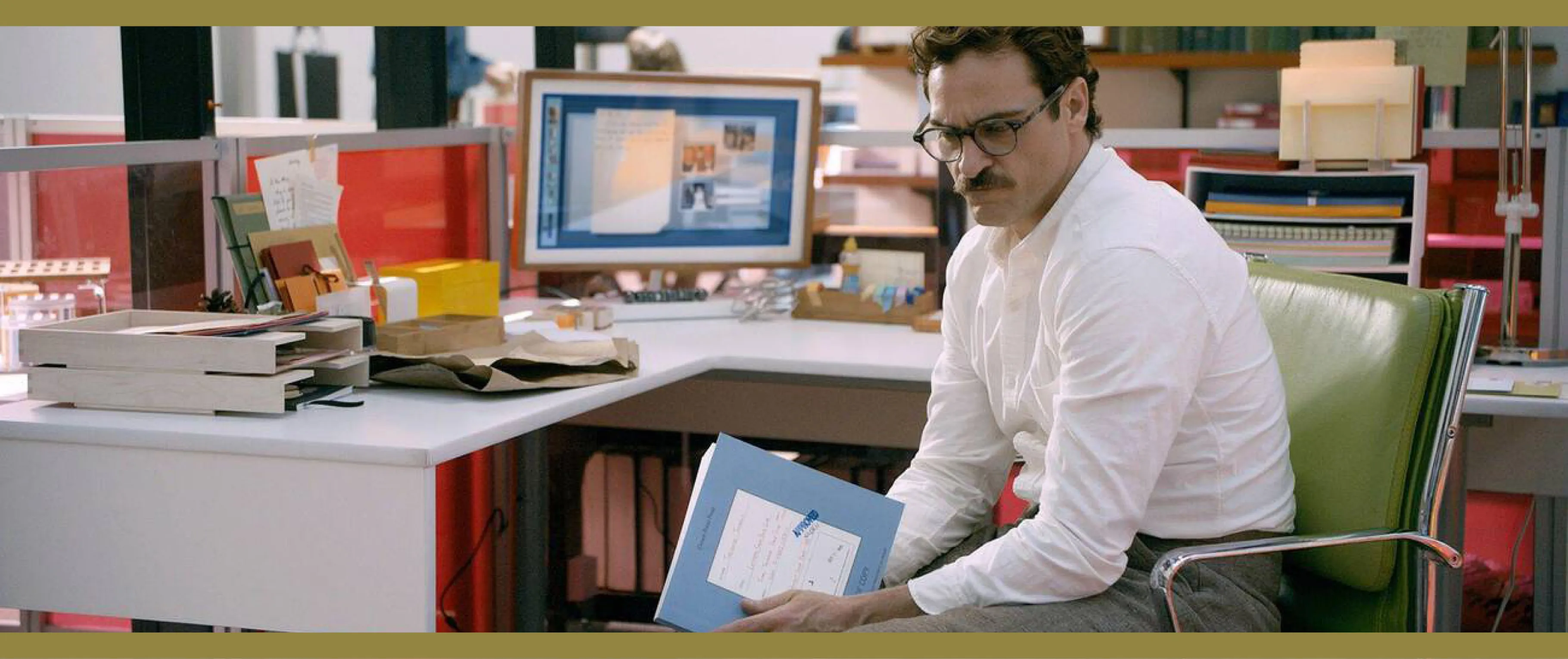
![]()
Joaquin Phoenix in Her
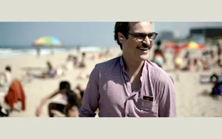
![]()
The visual language of Her
It’s easy for the near future to look passé in film, then?
Yeah, it really is, because you project too much. I’ve got a wonderful science-fiction book of visuals about the ’50s, ’60s, ’70s. It looks at all the ways we thought we would be living now that never came to pass, and it looks very antiquated! I think I start idealistically in my work and then come down to ideas that are fresh in their application for a specific film. So for Her, Spike and I started thinking: “Oh, great—we get to design the car of the future! We get to design devices of the future!” But then we thought, “No, that’s a terrible idea because people will be looking at them and thinking about them and they won’t think about the story.” And so we stumbled upon the idea of erasing technology so that you focus on the story and the character’s dilemma and put him in a perfect world where everything’s taken care of. There’s no social strata, and so all the dilemmas in the story are his own responsibility. They’re not caused by societal stuff. So then we decided just to make things that we liked. We said: “Hey, we’ve got good taste. Let’s not borrow from other films. Let’s just do things that we like and agree on.” And that’s mostly the path I take with directors who create their own material.
It sounds like in Her, you and Spike created a world that you’d be quite keen to live in.
It’s interesting with that movie—people always say, “Oh, I’d like to live in that world.” And I think that we do live in that world. All we did was take away some things that are kind of noisy and annoy us. So, for example, we erased almost all graphics. We also got rid of all sports clothes, denim, sneakers, casualness in a certain way. And then the costume designer said, “Okay, no belts, no collars.” The director of photography said, “No blue.” It made us look harder at the things that we wanted to retain. I’d say don’t think about what it’s going to look like but rather what the story needs, what’s appropriate to the character. Live and think through the character’s eyes. And avoid decoration, which is pleasant, but it’s not informative. Her became a future by subtraction of the present. You’re almost making an unseen psychological script that’s parallel to the one that really exists, that’s been written.
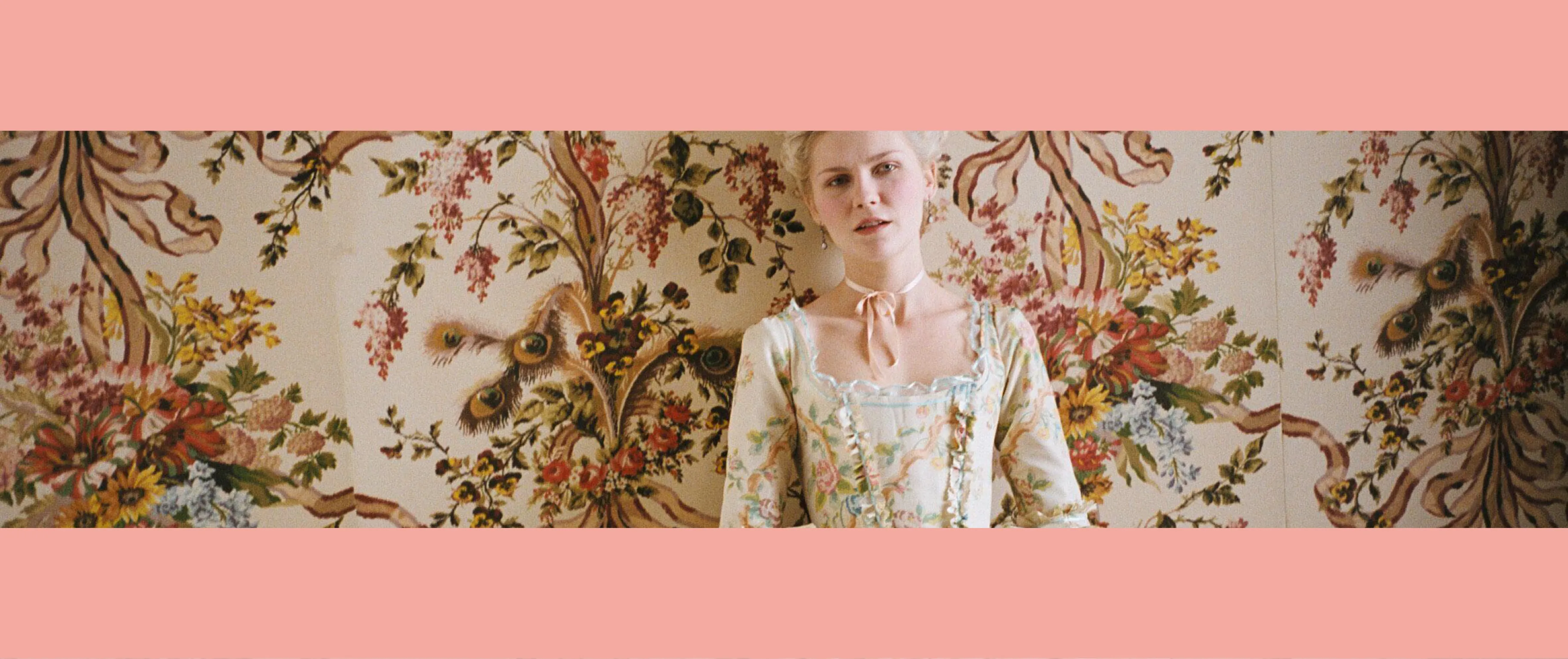
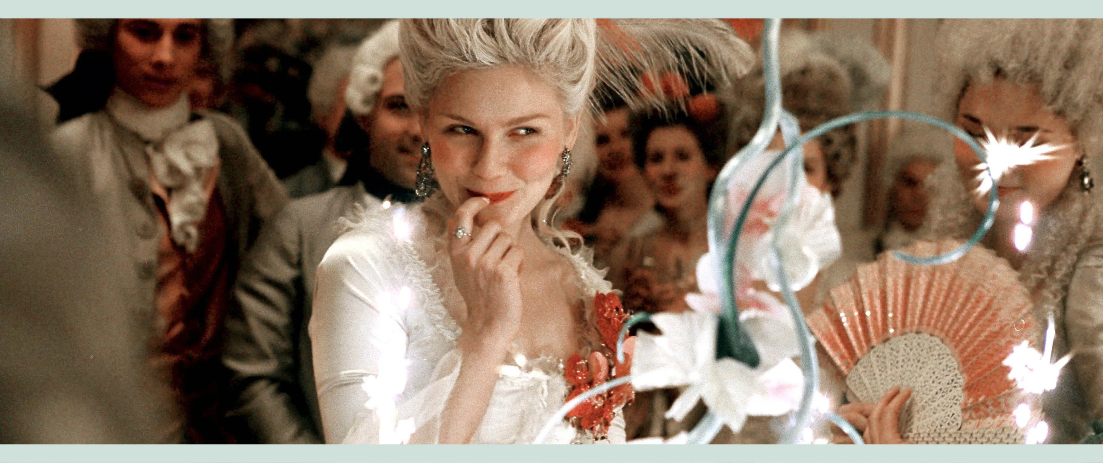
Kirsten Dunst as Marie Antoinette
“Visual language is a very dangerous thing to exercise verbally.”
Does that rationale for production design also lead toward character-building and help that side of the film along?
Yes, in some films you start practically by asking, What social strata does this person live in? What’s their economic position? How much of that world do we show? Do you only need to deal with those things if they’re part of the story? There tend to be threads between films that seem very different from the outside, too. So in Her and Marie Antoinette, both main characters were in the upper echelons of a quite carefree life and yet there was a sense of impending doom. In the case of Her, Theodore couldn’t relate to other humans except by the written word—and so it was his own problem. It wasn’t a societal problem. It is now our societal problem, I suppose. It was a foretelling of overuse of the internet and AI and things like that, but that’s a subtle accident. We didn’t plan that. In Marie Antoinette, she’s in a rich bubble, in an arranged marriage—that’s also a certain type of isolation. And we only see her perspective. It’s all seen through her eyes—but using a contemporary parallel, almost like a bling world. At the time, MTV’s Cribs was big, and we made a joke [parody of] Cribs with Jason Schwartzman walking around as the host, talking about the different rooms on set and commentating—very funny stuff. And it was a joke on the parallels between Paris Hilton and Marie Antoinette.
You talked of shaving off elements that could become distractions on Her, but for Marie Antoinette there’s such largesse and richness—not to mention the Palace of Versailles itself, which you were able to use as a location.
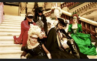
I really got to indulge in the fantasy of opulence. Sofia said the palette should all be pastel, not the deep ruby colors of the old court that could only be used by the old kings. That was my first film that went deep into history, so I had to research to know where I was making mistakes and where I was breaking reality. I made stuff up: There were sets that didn’t have any historical reference, and so I had to invent it. We knew that we were going to use contemporary music, and so you’ve constantly got one foot in the present and one foot in the past. Literally, in the case of the Converse sneakers that we put into one scene. Of course they were there on purpose! We also asked for a big old, ’60s white John Lennon Rolls-Royce to be in the background at an outdoor dinner party, but we just couldn’t find the right one. It was just going to be a small detail in the background—like the Converse—for people to notice and wonder, “Is that a mistake?”
![]()
Kirsten Dunst as Marie Antoinette
![]()
The pop decadence of Marie Antoinette
I love the idea of including these visual gags that are almost just for the crew’s benefit.
It was fun, and it also served to take the audience back in history but not in a way that might make them feel they’re watching a dusty reenactment of something. Rather, they’re following the path of Marie Antoinette’s present, which we hoped they’d see as not so different from today.
How do you communicate the look and feel and “rules” of the production design to the rest of the crew?
Well, visual language is a very dangerous thing to exercise verbally. And even with Spike, whom I’ve worked with a lot, we can both imagine something quite differently. So you have to start playing visual-aid cards quickly. “More like this?” “No, more like this.” “Do we like this?” It’s like an eye chart: “Is this more in focus? Is that more in focus?” It helps you narrow down the visuals for everyone else as well. I come on to a project quite early in the process, with only a director and a producer and sometimes a DP in mind, or a DP already attached. So we need to set up a visual library, a visual bible for the production, and constantly add to and subtract from it.
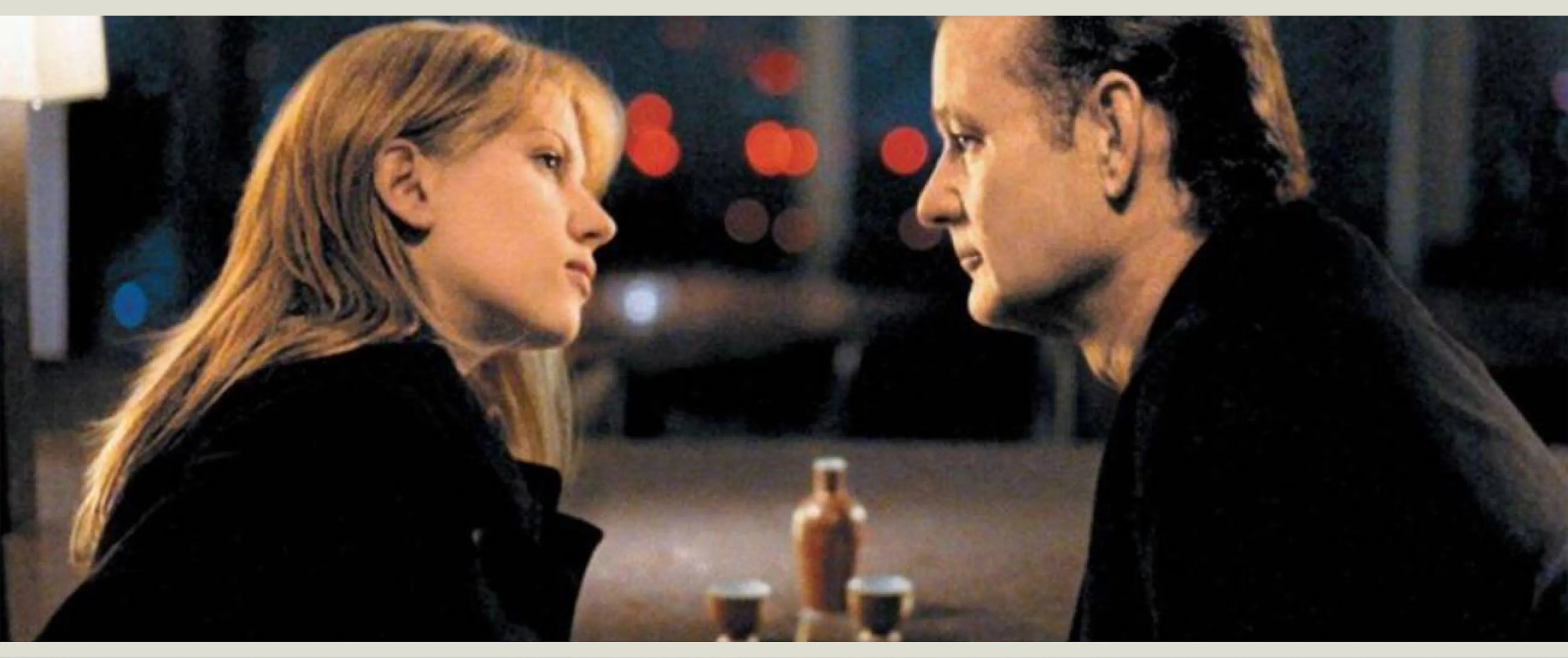
Lost in Translation, dir. Sofia Coppola, 2003
What’s the difference in making a very styled set, as for Marie Antoinette, and then something very contemporary and real, like for Lost in Translation, set in real locations and in a working hotel?
For me, contemporary is the hardest because you’re always trying to find the best, most condensed version of a real thing. I learned a big lesson on Lost in Translation—it was really a crash course in production design—because I started two weeks before filming began. The original designer, Anne Ross, sadly had to go home. So I took over, but I had been working on something else right up to the start of shooting. Sofia sent me what they’d done up to that point: They’d found the hotel and the stage where they were going to shoot the whiskey ad, but then there were all these other things—the karaoke bars and the nightlife and everything that I had to go and discover. I finally showed up the night before we started filming in Tokyo, to “open the set,” as we call it, where you make sure that everybody knows all the parts and you are happy with the set, and make adjustments if not. And then I would go off location-scouting, dealing with the department that I’d inherited and working out the rest of the details. Then we’d all meet again at dinner and I’d show what I’d found and have to leave early to go look at karaoke bars. Of course everybody would go, “I wanna come with you!”
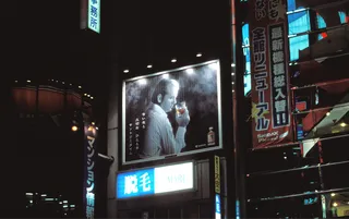
The palette in Lost in Translation really captures a sense of ennui and predawn insomnia as well as the fun of Tokyo’s nightlife. It’s intimate yet expansive. How did you achieve that?
It was kind of a gift that Charlotte [Scarlett Johansson’s character] was jet-lagged and that most of the film was at nighttime, because it’s a gorgeous light there in Tokyo. Beside the natural predawn light, the artificial stuff is just overwhelming—the neons are just wonderful. We were working very minimally. Sometimes Lance Acord, the DP, would just use a paper lantern to light a scene. We were very stripped down, running around guerilla-style, doing things economically, efficiently and untethered, finding things that would work naturally. And we were shooting on film, not digital, which is much more light-absorbing, but at the time you could push film and it would still take in a lot of light. So we were looking for locations that had natural light and natural wonder. I’m always looking for that dream point—something magical but real.
![]()
Bill Murray in Lost in Translation
![]()
Lost in Translation’s Tokyo nightscape
That’s the light of romance, isn’t it, the light that gets reflected in someone’s eyes, that’s deeply romantic and personal—a shortcut to the heart, if you can capture it?
That’s exactly it. I think you always want to be on the edge of shadows and on the edge of focus. You know, I think that digital photography has made too many people photographers and cinematographers and we haven’t really experimented or gotten to the point where we’re experimenting with the medium falling apart and seeing the dirty edge of shadows come into light. I think that’s the dream world. It’s about not being so literal. So if you can show something half in shadow, see the reflection in the eyes, as you say, it’s romantic and you want to live in that romantic world. I call it surface romance. Black-and-white imagery has surface romance because it’s not our reality—it’s a step away. You don’t want film to be so media that it’s like the news or sports. You want it to be once removed. You kind of want to be in the syrup of a crafted world. We all want to live in a little surface romance, don’t we?
Hell, yeah. We’ve talked about set design adding so much to atmosphere, character and storytelling, and your work is the only element of a film that’s in every single shot, in a way—but if it’s doing its job perfectly, it’s also strangely invisible. We might not really see it. Is that a frustration?
It’s not frustrating at all. It’s kind of like I’m the bass player: It’s constantly there, it’s working on you subliminally, especially below the waist, and it’s in your spine and your heartbeat. So it’s not what you notice. But you know what? You feel it.